How to Make a T-Chart in Google Docs: 7 Easy Steps (2026)
Need to compare two ideas in Google Docs, but plain paragraphs keep turning into a confusing wall of text? A rushed comparison can hide important differences, weaken an assignment, and make your notes difficult to scan. The longer you spend adjusting tabs, drawing lines, or fighting uneven spacing, the less time you have for the actual thinking. A T-chart gives you a simple visual structure: one topic on the left, another on the right, and related points lined up across both sides. The fastest approach is to create a two-column table, add a clear heading, and adjust the layout for readability. Follow the seven steps below, and you can build a clean T-chart in Google Docs in just a few minutes.
How to Make a T-Chart in Google Docs
A T-chart in Google Docs is a two-column table used to compare, contrast, sort, or organize ideas. The left column usually represents one category, while the right column represents a second category.
For example, you could compare a book character’s strengths and weaknesses, list pros and cons, or separate facts from opinions. Google Docs does not include a dedicated T-chart button, so the most reliable method is creating a two-column table and styling it like a large letter T.
Here are the seven steps:
- Open Google Docs and create a blank page.
- Insert a two-column table.
- Add headings to both columns.
- Enter your comparison points.
- Adjust column widths and row heights.
- Format the borders and text.
- Review, share, or export your finished chart.
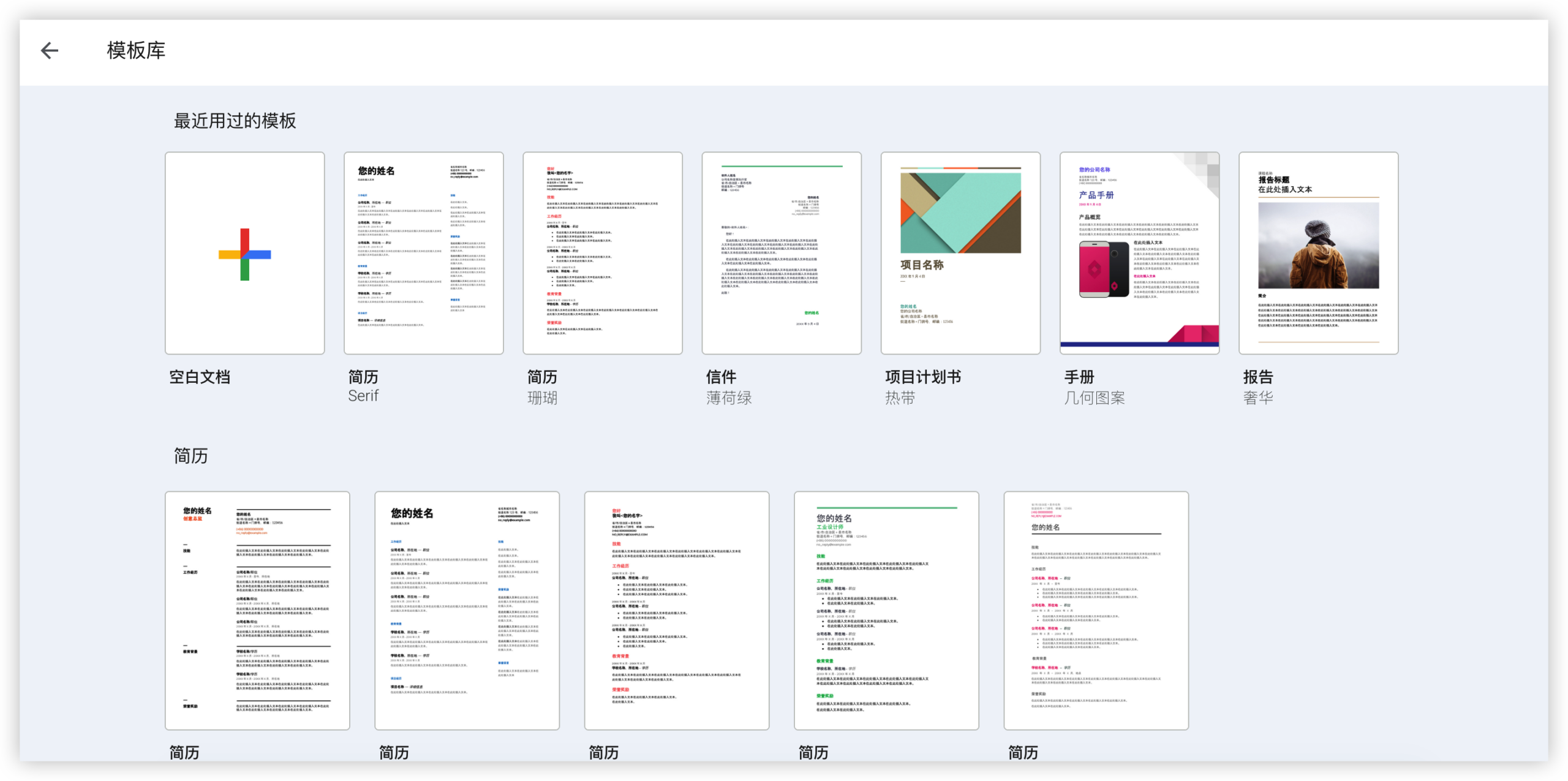
1. Open a Blank Google Docs Page
Go to Google Docs and open a blank page or an existing page where you want the chart to appear. Click where you want the T-chart placed.
If the chart will support an essay or class activity, leave a little space above it. You can add a title such as Renewable Energy: Advantages and Disadvantages before inserting the table.
2. Insert a Two-Column Table
Place your cursor in the correct position, then select Insert in the top menu. Choose Table, and select a table with two columns and at least two rows.
The first row will hold your category headings. The rows underneath will contain your ideas. You can add more rows later when your list grows.
For a quick pros-and-cons chart, choose two columns and six rows. This gives you one heading row plus five working rows.
3. Add Headings to Both Sides
Click the first cell and type the name of your first category. Then click the second cell and enter the name of the second category.
Useful heading pairs include:
- Advantages and Disadvantages
- Cause and Effect
- Facts and Opinions
- Before and After
- Similarities and Differences
- Character Strengths and Character Weaknesses
Keep headings short enough to scan quickly. Bold text can make them easier to distinguish from the points underneath.
4. Enter Your Comparison Points
Click each cell below the headings and type one idea per row. Align related points across the same row whenever possible.
For example, a chart comparing online and in-person classes could look like this:
| Online Classes | In-Person Classes |
|---|---|
| Flexible study location | Dedicated classroom setting |
| Recorded lessons may be available | Immediate face-to-face discussion |
| Requires reliable internet access | Requires travel to campus |
Use short phrases when the chart is meant for quick review. Full sentences work better when the T-chart supports a detailed assignment or study guide.
5. Adjust Column Widths and Row Heights
Move your pointer over the vertical line between the columns. When the resize pointer appears, drag the line left or right.
Make both columns equal when the categories deserve the same space. Give one column more room when its entries contain longer explanations.
You can also adjust row height by adding line breaks or changing the text size. Avoid stretching the chart unnecessarily. Large empty spaces make comparisons harder to follow.
6. Format the Borders and Text
Select the heading cells and apply bold formatting. You can also change the background color to create a visual distinction between the labels and the entries.
To change borders, select the table or specific cells. Use the toolbar options for border color, border width, and border style.
A simple classroom chart often works best with:
- Bold headings
- A light background color in the first row
- One consistent font
- Clear black or dark-gray borders
- Left-aligned text for longer explanations
Keep color choices restrained. Two or three coordinated colors usually create stronger visual organization than a different color in every row.
7. Review and Share the Finished Chart
Read both columns from top to bottom. Check spelling, remove repeated ideas, and confirm that each point belongs under the correct heading.
Then check whether related items appear on the same row. A misaligned comparison can confuse readers even when every individual entry is accurate.
When the chart is ready, use Google Docs sharing controls to collaborate with classmates or colleagues. You can also print the page or download it in a format supported by your workflow.
When a T-Chart Works Best
A T-chart is useful whenever you need to divide information into two clear categories. It helps your reader understand the organizing principle before reading every detail.
For instance, a teacher might ask students to sort statements into fact and opinion. A project team could separate current problems from possible solutions. A writer might compare two characters before planning a story.
Here's why the format works: the vertical division creates a visual boundary, while the horizontal rows make related ideas easier to compare.
Common Classroom Uses
Students often use T-charts during brainstorming, reading comprehension, and revision. A history student could list events on one side and their consequences on the other.
A science student might separate observations from interpretations. In language learning, one side could show vocabulary in English while the other side provides definitions or translations.
The chart also works before writing a paragraph. For example, listing evidence on one side and explanations on the other can reveal gaps in an argument.
Work and Personal Planning Uses
You can use the same layout for meeting preparation, decision-making, and task sorting. Try separating short-term priorities from long-term priorities before planning your week.
Suppose you are evaluating two event locations. The left column could cover Location A, while the right column covers Location B. Rows might compare cost, travel time, capacity, and accessibility.
The best part? You can turn a rough list into a readable comparison without learning a specialized design tool.
How to Make Your Chart Easier to Read
Good formatting helps the reader find the important information quickly. Start with descriptive headings, then keep each entry focused on one idea.
A crowded cell often signals that the point needs editing. If one entry contains three separate arguments, split it into multiple rows or shorten the wording.
Use Parallel Meaning Across Rows
Each row should compare similar types of information. If the left cell describes cost, the right cell should also describe cost.
For example, this pairing is clear:
| Electric Car | Gasoline Car |
|---|---|
| Lower fuel spending | Higher fuel spending |
| Longer charging stops | Shorter refueling stops |
This pairing is weaker because the categories differ:
| Electric Car | Gasoline Car |
|---|---|
| Lower fuel spending | Popular blue model |
Before finalizing a row, ask yourself whether both cells answer the same question.
Choose Readable Text Length
Short phrases make a chart easier to scan. Use a full sentence when context matters, such as in a literary analysis or research planning activity.
If the table becomes too wide, reduce the wording before shrinking the font. A smaller font may create a cramped layout that is difficult to read on mobile screens or printed pages.
Use Color for Structure
Color can signal category relationships. A soft blue heading for one side and a soft green heading for the other side may help readers navigate the chart.
Check contrast before sharing. Dark text on a light background is usually easier to read than bright text on a saturated background.
How to Create a T-Chart on Different Devices
The basic process is similar across computers, tablets, and phones, although the menus may appear in different places.
On a Computer
A computer gives you the most control over column widths, border styling, and larger charts. Use the top menu to insert the table, then drag the borders into position.
This option works well for assignments with many rows or longer explanations. You can also review the whole layout at once before printing or sharing.
On a Tablet
On a tablet, tap the editing controls to find the insert option. You may need to swipe through the toolbar before the table command appears.
Tables with several rows can be harder to resize on a smaller screen. Enter the main content first, then return to formatting when the chart is complete.
On a Phone
A phone is useful for adding quick ideas, but precise table formatting can take longer. If you need a polished result, create the structure on a larger screen when possible.
You can still add short entries, correct wording, and review the chart from your phone. Keep the entries brief so the layout remains manageable.
Alternatives to a Basic Two-Column Table
A standard table is the fastest choice, though other approaches can suit particular projects.
Use Drawing Tools for a More Visual Layout
Google Docs drawing tools can help you create custom shapes, lines, and text boxes. This approach gives you more control over the appearance of a traditional T shape.
It can work for posters or presentations, especially when you need arrows, icons, or decorative elements. However, editing many text entries may take longer than working inside a table.
Use a Template for Repeated Activities
If you create the same type of chart often, prepare a reusable layout with headings, spacing, and basic formatting already in place.
A teacher could prepare a blank Claim and Evidence chart for weekly lessons. A project manager could keep a reusable Risks and Responses layout for planning sessions.
Use a Larger Comparison Matrix
When you need to compare three or more categories, a T-chart may become restrictive. A comparison matrix with additional columns can provide more room.
For example, comparing three software options may require columns for price, collaboration, security, and support. Choose the simplest structure that answers the question clearly.
Common Mistakes and Practical Fixes
Adding Too Many Ideas to One Cell
Problem: A cell contains a paragraph with several unrelated points.
Fix: Break the content into separate rows, or move detailed explanations below the chart. The T-chart should support quick comparison.
Using Unclear Headings
Problem: Labels such as Side A and Side B force readers to guess what each column means.
Fix: Replace vague labels with precise categories. For example, use Benefits and Drawbacks.
Leaving Related Points on Different Rows
Problem: Similar topics appear far apart, so the reader has to search for the connection.
Fix: Organize rows by theme, such as cost, time, quality, or impact.
Overusing Decorative Formatting
Problem: Bright colors, multiple fonts, and thick borders compete with the content.
Fix: Use formatting to create hierarchy. Bold headings and modest shading are usually enough.
Natural T-Chart and Knowledge Management Solution: ONES.com
Google Docs is useful for quickly creating a two-column comparison. If your team needs to connect those comparisons with project work, repeatable processes, and shared knowledge, ONES.com provides a broader workspace.

ONES.com combines project management and knowledge management, powered by ONES Assistant. ONES Project is a Jira alternative for project coordination, while ONES Wiki is a Confluence alternative for organized team knowledge. They are sold separately.
Value Proposition
ONES.com can help you move from a one-time comparison chart to a structured place for decisions, action items, project context, and team guidance.
Core Capabilities
- Scattered comparison notes → ONES Wiki: Store decision explanations and team guidance in organized knowledge pages, making future reference easier.
- Unclear follow-up work → ONES Project: Convert conclusions into assigned tasks, deadlines, and visible progress.
- Manual status tracking → Built-in reporting: Review project progress through reports instead of collecting updates from separate conversations.
- Rigid project structures → Custom workflows and fields: Adapt work stages and details to approval processes, research activities, or operational planning.
- Disconnected sprint planning → Sprint management: Group related work into planned cycles and give the team a clearer delivery target.
- Repeated administrative steps → Automation: Reduce routine actions by triggering workflow changes or notifications through configured rules.
- Plugin-heavy project setups → Native capabilities: Handle common planning and reporting needs with fewer additional extensions.
- Restricted deployment requirements → On-premise, private cloud, or air-gapped deployment: Choose a deployment model that fits your organization’s technical and security needs.
- Migration concerns → Jira-compatible workflows: Preserve familiar project patterns while evaluating a Jira alternative.
ONES.com offers four deployment options: Cloud, On-Premise, Private Cloud, and Air-gapped. The self-hosted version has full feature parity with the cloud version. A free plan supports up to 30 seats.
Application Scenarios
Class project planning: Students can compare research ideas in a T-chart, then track selected tasks and deadlines in ONES Project. The final reasoning can remain available in ONES Wiki for the group.
Product decision meetings: A team may compare two approaches during a meeting. After choosing one, the team can record the decision, assign implementation work, and monitor progress through a connected workflow.
Restricted environments: An organization with strict network controls may need project and knowledge management within an air-gapped environment. ONES.com supports that deployment requirement while retaining feature parity.
Common Challenges
Challenge: The Table Looks Too Narrow
Solution: Shorten long entries, reduce unnecessary margins, or move the chart to a page with more horizontal space. Equal-width columns are a good starting point.
Challenge: The Chart Spans Several Pages
Solution: Remove repeated wording and combine closely related ideas. If the chart still needs many rows, divide it into sections with separate headings.
Challenge: The Comparison Feels Unbalanced
Solution: Review whether both categories use the same criteria. Add matching rows for cost, time, effort, or impact so the comparison has a consistent basis.
Challenge: Collaboration Creates Conflicting Edits
Solution: Assign one person to maintain the layout while others contribute suggestions. Use comments for questions that need discussion before changing the chart.
FAQs
Does Google Docs have a built-in T-chart template?
Google Docs does not usually provide a dedicated T-chart button. You can create one quickly with a two-column table, which gives you editable rows, adjustable borders, and flexible formatting. For a more decorative design, drawing tools may work better. For most assignments, planning activities, and comparisons, the table method is faster and easier to maintain.
How many rows should a T-chart have?
Use enough rows for your ideas without creating unnecessary empty space. A small comparison may need four or five rows, including the heading row. A detailed activity may need ten or more. You can add rows as you work, so starting with a modest table is practical. Focus on grouping related points rather than reaching a particular row count.
Can I add colors to a T-chart in Google Docs?
Yes. Select a cell or group of cells, then use the table background color control to add shading. You can also adjust border color and thickness. Light colors usually preserve readability, especially when the chart may be printed. Keep the heading treatment consistent across both sides unless color has a specific meaning.
What should I put in the two columns?
Put two related categories in the columns. Common examples include pros and cons, causes and effects, similarities and differences, or facts and opinions. Choose categories that answer the same general question. If one side contains costs and the other contains personal preferences, the comparison may feel uneven because the categories use different criteria.
Can I use a T-chart for a work project?
Yes. A T-chart can help compare vendors, organize risks and responses, separate current conditions from desired outcomes, or prepare for a decision meeting. Keep the entries concise and group them by criteria. After the discussion, record the decision and turn agreed actions into assigned tasks so useful ideas do not remain only in the comparison.
Conclusion
To make a T-chart in Google Docs, insert a two-column table, add clear headings, enter related points, adjust the layout, and format the borders for readability. The process takes only a few minutes once you know where to find the table tool.
But here's the truth: a chart becomes useful when its categories are clear and its rows support meaningful comparisons. Keep one idea per cell, align related points, and remove visual clutter.
If you need a quick classroom comparison, Google Docs is a practical choice. If your team needs to connect decisions with projects and shared knowledge, ONES.com can provide a broader workspace for that ongoing process.