How to Make a Gantt Chart in Google Docs: 7 Easy Steps Today
Gantt charts make deadlines, dependencies, and workload easier to understand. Yet creating one in Google Docs can feel awkward because Docs does not include a native Gantt chart feature.
You may end up fighting table borders, manually coloring cells, and adjusting dates whenever the schedule changes. A small update can quickly turn into a frustrating formatting task.
But here's the truth: you can build a clear project timeline in Google Docs with a simple table and seven practical steps. This guide shows you how to plan the structure, add time blocks, mark progress, and keep the result readable. You will also see when a dedicated project management platform makes more sense for complex schedules.
How to Make a Gantt Chart in Google Docs in 7 Steps
A Gantt chart in Google Docs is a table-based project timeline. Tasks appear in rows, while dates run across columns and colored cells show when each task happens.
The method works well for small projects, school assignments, content calendars, event planning, and simple team schedules. For a large project with frequent changes, you may eventually need a dedicated project management tool.
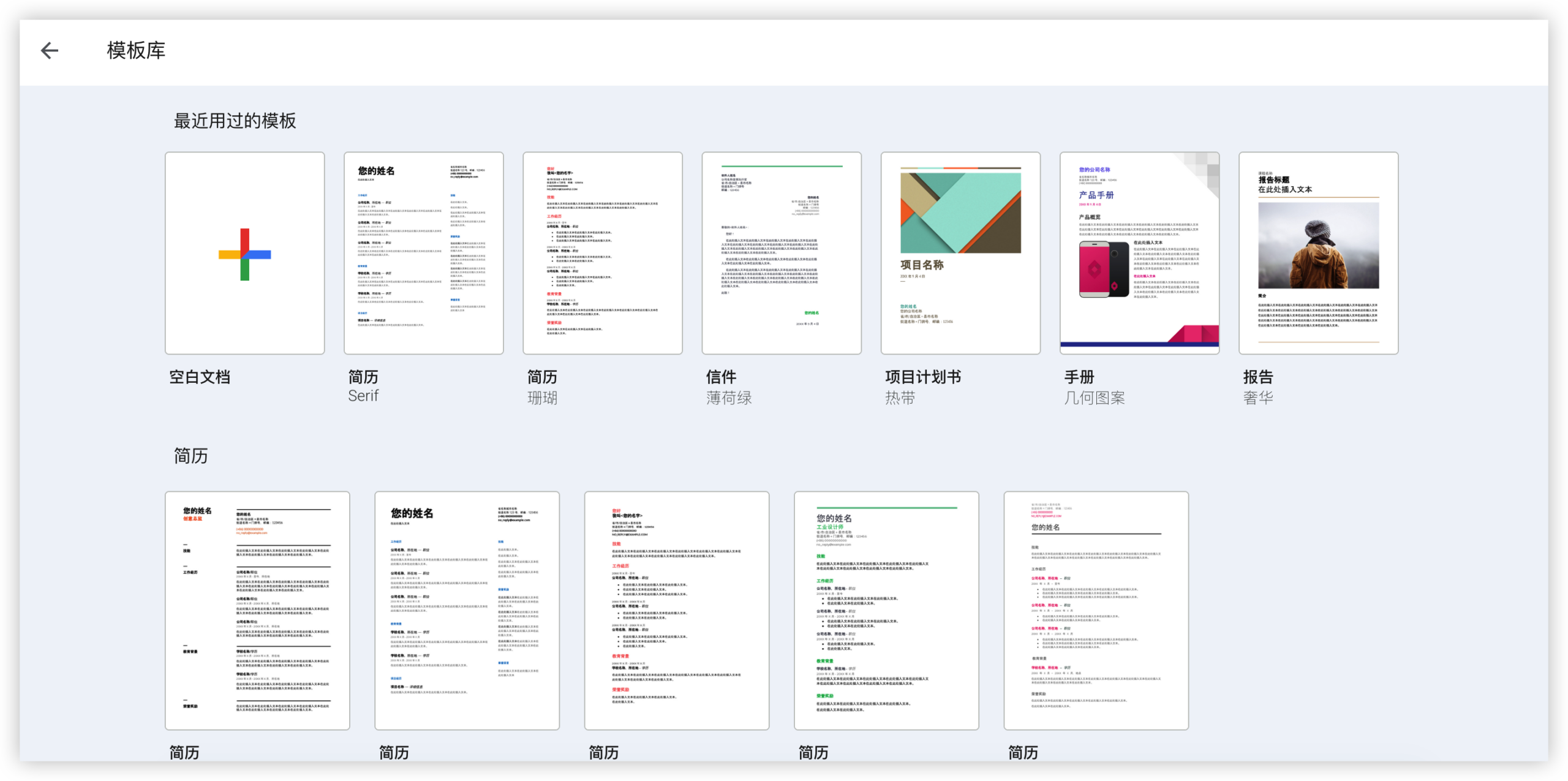
Step 1: Plan the information your chart needs
Start by listing the project activities before opening Google Docs. Each activity should have a clear name, a start date, an end date, and an owner when responsibilities are shared.
For example, a website launch might include these activities:
- Gather requirements
- Create page layouts
- Write website copy
- Build the pages
- Review and test
- Publish the website
Keep each activity specific. “Website work” is too broad to schedule effectively, while “Approve homepage layout” gives you a clear milestone.
Step 2: Create a new Google Docs page
Open Google Docs and create a blank page. Give it a descriptive name, such as “Website Launch Timeline,” so your team can recognize it quickly.
At the top, add the project name, project manager, planned start date, and current status. This small heading gives readers context before they inspect the timeline.
You can also add a short legend:
- Blue cells mean planned work
- Green cells mean completed work
- Yellow cells mean work in progress
- Red cells mean a blocked activity
Step 3: Insert a table for the timeline
Place your cursor below the project heading. Select Insert, choose Table, and create enough columns for your task details and time periods.
For a weekly schedule, use columns for:
- Task name
- Owner
- Status
- Week 1
- Week 2
- Week 3
- Week 4
Add one row for each activity, plus a header row. If you need daily planning, use one column per day. However, daily charts become wide quickly, so weekly columns are usually easier to read.
Step 4: Add task details and time periods
Enter each activity in the first column. Add the responsible person and current status in the next columns.
Then label the timeline columns with dates or time periods. You might use:
- June 3–7
- June 10–14
- June 17–21
- June 24–28
Use one consistent time scale. Mixing weeks and individual days in the same chart makes the schedule harder to interpret.
Step 5: Shade cells to create task bars
This is the key step. Select the cells that represent the period when each activity will happen, then apply a background color.
For example, shade the “Gather requirements” row across Week 1. Shade “Create page layouts” across Weeks 1 and 2. The colored cells now act as horizontal task bars.
To add color, highlight the cells, open the table color controls, and choose a fill color. Keep the palette limited to three or four colors.
Use a lighter shade for planned work and a darker shade for completed work. That contrast helps readers understand progress without reading every status label.
Step 6: Add milestones and dependencies
A milestone is an important point with little or no duration. Examples include “Requirements approved,” “Design signed off,” and “Website published.”
You can mark a milestone with a symbol such as ◆, a bold date, or a single colored cell. Add a short explanation beneath the chart if the symbol may confuse readers.
Dependencies show that one activity must happen before another. For example, development may depend on approved layouts. Google Docs does not draw dependency arrows automatically, so describe important relationships in a notes column.
A simple note might say, “Build begins after layout approval.” This keeps the relationship visible without overcrowding the table.
Step 7: Review, format, and share the chart
Review the timeline from left to right. Check that every activity has a start period, an expected finish, and a clear status.
Then improve readability by:
- Making the header row bold
- Centering time-period labels
- Aligning status labels consistently
- Widening the task column
- Using borders sparingly
- Keeping the legend near the chart
Share the page with the right permission level. Give collaborators editing access when they need to update progress. Use commenting access when you only want feedback.
What a Google Docs Gantt Chart Can and Cannot Do
Google Docs works well when you need a quick visual schedule that several people can view and edit. It is familiar, accessible, and easy to share through a browser.
Its main limitation is manual maintenance. If a task moves from Week 2 to Week 4, you must recolor cells yourself. If a dependency changes, the chart will not recalculate the rest of the schedule.
When this approach works well
A table-based timeline is a practical choice for a two-week event plan, a student assignment, or a small marketing campaign with fewer than 15 activities.
For example, a team planning a webinar can show promotion, speaker preparation, rehearsal, and event day in one compact view. Few updates are needed, so manual formatting remains manageable.
When you should use another approach
A dedicated project platform becomes more useful when you manage dozens of activities, recurring deadlines, multiple teams, or frequent schedule changes.
Consider switching when people need automatic reminders, task dependencies, progress reports, workload views, or a history of changes. Those needs quickly expose the limits of a manually colored table.
How to Make the Timeline Easier to Read
A Gantt chart should answer three questions quickly: what needs to happen, when will it happen, and who owns it?
If readers must decode every color or scan across a very wide table, the design needs attention. Clear formatting often matters more than adding extra detail.
Use one row for one activity
Do not combine unrelated work in one row. “Design, write, and test landing page” hides three different activities with different owners and deadlines.
Separate them into individual rows. This lets you shade different time periods and identify delays more accurately.
Limit the number of colors
Color overload creates confusion. Use one color for planned work, one for completed work, and one for blocked work.
For instance, blue can represent scheduled activity, green can represent finished activity, and red can indicate a problem. Add text labels so the chart remains understandable for people with color-vision differences.
Keep the timeline proportional
A one-day activity should not appear as wide as a three-week activity. Use consistent columns so the visual length reflects the planned duration.
If you use weekly columns, explain that each shaded cell represents one week. For daily planning, switch to a narrower font and consider landscape page orientation.
Common Mistakes to Avoid
Small formatting choices can make a schedule look polished while still hiding important planning problems. Review these issues before sharing your chart.
Adding too much detail
A Gantt chart is a schedule overview, not a complete task brief. Long descriptions make rows difficult to scan.
Keep the chart concise. Place detailed instructions, links, and acceptance criteria in a separate project area.
Skipping ownership
A timeline without owners shows when work happens but not who is responsible. Add an owner column whenever more than one person participates.
For example, “Review and test” could belong to a quality specialist, while “Publish the website” could belong to the release manager.
Ignoring task dependencies
Two bars may look complete even though one activity cannot begin until another finishes. Add a notes column for important dependencies.
For critical work, write the relationship clearly. “Testing starts after build approval” is more useful than a vague arrow or unexplained symbol.
Failing to update progress
A stale chart creates false confidence. Schedule a regular review, such as every Monday morning, and update status colors before the team meeting.
When a deadline changes, update the bar and add a short note explaining why. This keeps the schedule understandable after several revisions.
Google Docs Alternatives for More Structured Project Planning
A manually built chart is helpful for simple planning, but complex projects need stronger coordination. The right choice depends on how often your schedule changes and how many people need to act on it.
| Planning need | Suitable approach |
|---|---|
| Small schedule with occasional updates | Google Docs table |
| Quick visual planning with date calculations | A dedicated timeline tool |
| Tasks with dependencies and reminders | Project management software |
| Several teams with different workflows | A centralized project platform |
| Project work alongside team knowledge | A platform combining project and knowledge management |
Google Docs remains useful for meeting notes, project briefs, and lightweight schedules. You do not need to replace it for every planning task.
But here's the truth: once people update several versions of the same timeline, coordination becomes harder. A centralized workspace can connect tasks, status, ownership, and supporting knowledge.
Natural Gantt Chart Solution: ONES.com

Value Proposition
ONES.com combines project management and knowledge management in one platform. ONES Project provides structured project planning, while ONES Wiki supports shared team knowledge; the products are sold separately.
It can suit teams that have outgrown manually formatted timelines but still need flexible workflows, reporting, and controlled deployment options.
Core Capabilities
Manual schedule updates
Pain: Moving a task in Google Docs requires recoloring cells and checking nearby dates manually.
ONES capability: ONES Project supports structured task planning, sprint management, and configurable workflows.
Result: Your team can manage changing work through task records and workflow states rather than repeatedly rebuilding visual bars.
Unclear task ownership
Pain: A colored timeline may show activity without making responsibility obvious.
ONES capability: Assign tasks to team members and organize work through project views and status fields.
Result: Each activity has clearer accountability, making follow-up easier during reviews.
Limited progress visibility
Pain: A table-based chart rarely provides built-in reporting for completion, blocked work, or workload.
ONES capability: ONES Project includes built-in reporting and customizable fields.
Result: Managers can inspect project health without manually counting colored cells.
Rigid planning structures
Pain: Every team may organize work differently, while a fixed Google Docs table often treats every activity the same way.
ONES capability: Custom workflows and fields let teams adapt project structures to their operating needs.
Result: Product, engineering, marketing, and operations teams can manage work with relevant stages and information.
Repetitive administrative work
Pain: Recurring updates and routine transitions consume time in a manually maintained timeline.
ONES capability: Automation can handle selected workflow actions and repetitive project operations.
Result: Your team spends less time maintaining status and more time completing planned work.
Separate project and knowledge spaces
Pain: Project decisions, instructions, and schedules can become scattered across different pages.
ONES capability: ONES.com provides ONES Project for project management and ONES Wiki for knowledge management.
Result: Teams can connect execution with shared guidance while choosing the product combination that fits their needs.
Plugin-heavy workflows
Pain: Adding many extensions can increase setup effort and create inconsistent experiences.
ONES capability: ONES Project includes Jira-compatible workflows, reporting, custom fields, sprint management, and automation as native capabilities.
Result: Teams may reduce dependence on multiple plugins when those capabilities match their planning requirements.
Restricted deployment requirements
Pain: Some organizations cannot place project information in a public cloud environment.
ONES capability: ONES.com offers Cloud, On-Premise, Private Cloud, and Air-gapped deployments.
Result: Teams can select a deployment model that aligns with their security and network requirements. The self-hosted version maintains feature parity with the cloud version.
Application Scenarios
Software release planning: An engineering team can manage requirements, development, testing, and release work through Jira-compatible workflows. Sprint planning and automation can support regular delivery cycles.
Marketing campaign coordination: A marketing team can organize copywriting, design, approvals, and publishing with custom fields for campaign type, channel, and status.
Restricted-network project delivery: A regulated team can use an On-Premise, Private Cloud, or Air-gapped deployment when network controls require self-hosted project management.
Common Challenges and Practical Solutions
The chart becomes too wide
Problem: Daily columns can stretch across several pages, forcing readers to scroll or zoom.
Solution: Use weekly columns for the overview. Keep daily planning in a separate task view or a dedicated project platform.
Color formatting changes unexpectedly
Problem: Adding rows or copying cells can create inconsistent fills and borders.
Solution: Format one clean row first, then copy its structure. Review the entire chart after major edits.
People cannot tell what each color means
Problem: A chart with several shades may look attractive but communicate very little.
Solution: Add a visible legend and pair every important color with a written status label.
Dates become outdated
Problem: Manual timelines do not automatically shift when an activity finishes late.
Solution: Assign one person to review the schedule on a fixed cadence. For frequent changes, move the planning workflow into project management software.
The schedule does not show workload
Problem: A Gantt chart can show timing while hiding that one person owns six activities at once.
Solution: Add an owner column and review overlapping assignments. Use workload reporting when the project involves many contributors.
FAQs
Can I create a real Gantt chart directly in Google Docs?
Google Docs does not provide a dedicated Gantt chart feature. You can create a practical approximation with a table, date columns, and colored cells.
This approach works for simple schedules. It does not automatically calculate durations, shift dependent activities, or refresh progress reports.
Should I use daily or weekly columns?
Use weekly columns for a project overview and daily columns for short activities that need close coordination.
A four-week campaign may need four weekly columns. A five-day event setup plan may benefit from one column per day.
How many activities should a Google Docs timeline include?
There is no fixed limit, but readability usually declines as the chart grows. Around 10 to 20 activities is often manageable for a shared overview.
Break larger projects into phases or create separate timelines for different teams. A shorter overview is easier to discuss in meetings.
How can I show progress in the chart?
Use a status column with labels such as Planned, In Progress, Complete, and Blocked. You can also use different shades for planned and completed portions.
Keep the legend visible. Written status labels should support the colors rather than relying on color alone.
Can I add dependencies in Google Docs?
You can describe dependencies in a notes column or mark them with symbols. Google Docs will not automatically recalculate the schedule when a dependency changes.
For example, write “Testing starts after build approval” beside the testing activity. This is clear for a small project, but complex dependency networks need specialized software.
When should I move from Google Docs to project management software?
Consider switching when schedules change often, several teams share responsibilities, or people need reminders, automation, reporting, and workload visibility.
A manually colored table remains useful for quick communication. A project platform becomes more practical when the timeline must also coordinate execution.
Conclusion
You can make a Gantt chart in Google Docs by planning your activities, inserting a table, adding time columns, shading task periods, marking milestones, and reviewing the finished timeline.
The method is simple and effective for small projects. Keep the chart narrow, use a clear color legend, assign owners, and review changes regularly.
But here's the truth: a manual chart becomes harder to maintain as dependencies, contributors, and deadlines increase. When your schedule needs automation, reporting, structured workflows, or controlled deployment, a platform such as ONES.com can provide a more scalable way to manage the work.