How to Create a Timeline Gantt Chart in Excel: 8 Easy Steps
Building a project timeline in Excel can feel harder than the work itself. You may have dates, tasks, owners, and deadlines scattered across several worksheets, yet still lack a clear view of what happens when. A basic list rarely shows overlapping work, delays, or dependencies clearly.
That confusion creates practical problems. A missed start date can push several tasks forward, while a crowded chart may hide the work that needs attention first. Manual formatting also becomes frustrating when plans change every few days.
But here's the truth: you can create a useful timeline Gantt chart in Excel with a stacked bar chart and eight straightforward steps. I’ll show you how to prepare the schedule, build the visual timeline, format it, and keep it readable as your project develops.
How to Create a Timeline Gantt Chart in Excel
A timeline Gantt chart in Excel is a horizontal project schedule that shows when each task starts, how long it lasts, and when it should finish. Excel creates this view by using a hidden start-date series and a visible duration series in a stacked bar chart.
Here’s why: the start-date series pushes each task to the correct point on the timeline, while the duration series displays the task as a colored bar. Once the setup is correct, the chart becomes much easier to read than a plain task list.
Step 1: Define the Work You Need to Track
Start with the tasks that matter to your project. Avoid adding every minor action immediately. A useful first version might contain planning, design, development, testing, launch preparation, and release.
For example, a website project could include these tasks:
- Confirm project requirements
- Create page layouts
- Build the website
- Review content
- Complete quality checks
- Publish the website
Keep each task specific enough to have a clear start and finish. “Work on website” is difficult to schedule, while “Build product page” gives you a measurable activity.
Step 2: Create the Schedule Columns
Open a blank Excel worksheet and create four columns with these headings:
- Task
- Start Date
- End Date
- Duration
Enter one task per row. Use real calendar dates for the start and end points. Then calculate the duration with a formula such as:
=C2-B2+1
If the start date is in column B and the end date is in column C, place this formula in column D. The +1 counts both the first and last day. Without it, a task starting and ending on the same day would show zero days.
Step 3: Check the Dates and Durations
Before creating the chart, review the schedule for errors. Make sure every end date comes after its start date, unless the task lasts only one day.
You can add a simple check in another column:
=IF(C2<B2,"Check dates","OK")
This flags reversed dates before they distort the visual. Also check whether weekends should count. Excel’s basic duration formula counts calendar days, while a workday schedule may require:
=NETWORKDAYS(B2,C2)
Choose one approach and use it consistently. Mixing calendar days with working days can make a two-week activity appear longer or shorter than expected.
Step 4: Insert a Stacked Bar Chart
Select the Task, Start Date, and Duration columns. Then choose Insert, select Bar Chart, and choose Stacked Bar.
Excel will create two colored sections for each task. The first section represents the start date, and the second section represents the duration. The first section is necessary for positioning, but you will hide it later.
You might be wondering: why use a bar chart instead of a column chart? Horizontal bars give task names more room and make long project schedules easier to scan.
Step 5: Arrange the Tasks in the Correct Order
Excel may display the first task at the bottom of the chart. To reverse the order, right-click the vertical task axis and choose Format Axis. Then select Categories in reverse order.
The first task should now appear at the top. This small adjustment makes the chart follow the same top-to-bottom order as your schedule.
If the task labels are cramped, widen the chart or reduce the font size slightly. Avoid shrinking the labels so much that people need to zoom in to understand the plan.
Step 6: Hide the Start-Date Series
Click one of the start-date sections in the chart. Open the formatting options and set its fill to No Fill and its border to No Line.
The start-date series will disappear visually, leaving only the duration bars. The bars still begin at the correct calendar positions because the hidden series continues to control their placement.
Let me explain: the blank area before each colored bar is not wasted chart space. It represents the time between the beginning of the timeline and that task’s start date.
Step 7: Format the Timeline and Task Bars
Click the horizontal date axis and adjust its minimum and maximum bounds. Set the minimum close to the earliest start date and the maximum just beyond the latest end date. This removes unnecessary empty space.
You can also change the major unit. A seven-day interval works well for many short projects, while a one-month interval may suit a longer plan.
Next, choose a clear color for the visible duration bars. A single color creates a calm overview. You can use two or three colors when the colors have a clear meaning, such as:
- Blue for planned work
- Orange for work at risk
- Green for completed work
Keep the legend only if the colors require explanation. Otherwise, remove it to create more space for the schedule.
Step 8: Add Milestones and Maintain the Chart
A standard stacked bar chart shows task durations well, but milestones need extra attention. You can add a milestone as a one-day task, use a separate marker series, or place a text box above the relevant date.
For example, “Design approved” could appear as a one-day activity between design and development. “Launch day” could use a contrasting diamond or a short colored bar.
When dates change, update the schedule cells instead of dragging bars manually. The chart should refresh automatically when its linked values change.
The best part? Once the structure is set up, you can reuse the same pattern for product launches, marketing campaigns, construction planning, and internal initiatives.
How the Excel Timeline Works
The chart uses two numeric values for every task: a starting position and a length. Excel treats each date as a number, which allows the stacked bar chart to place activities along a calendar axis.
Imagine a task beginning on June 5 and lasting four days. The hidden start-date segment pushes the visible bar forward to June 5. The duration segment then stretches from June 5 through June 8.
This explains why hiding the first series matters. You are removing its color, not removing its function. If you delete that series entirely, the bars lose their correct position.
Example Schedule
Suppose you are preparing a product release. Your schedule could look like this:
| Task | Start Date | End Date | Duration |
|---|---|---|---|
| Confirm requirements | June 3 | June 5 | 3 days |
| Create design | June 6 | June 12 | 7 days |
| Build release | June 13 | June 21 | 9 days |
| Run testing | June 24 | June 27 | 4 days |
| Publish release | June 28 | June 28 | 1 day |
The resulting visual makes the handoff between design and development easy to spot. It also shows the weekend gap before testing, which may be intentional or may require a schedule review.
Ways to Make the Chart Easier to Use
A chart can be technically correct and still be difficult to understand. The most useful timeline answers three questions quickly: what is happening, when is it happening, and what needs attention?
Use Consistent Date Formatting
Choose a date format that fits the planning horizon. A short project might use day and month labels, while a year-long initiative may need month and year labels.
For example, Jun 5 is easier to scan than a full timestamp when the chart covers only six weeks. Avoid showing more precision than the team needs.
Separate Planning from Status
Duration bars show timing, but they do not automatically explain progress. Add a status column with values such as Planned, In progress, Blocked, and Complete.
You can then use conditional formatting in the schedule or apply separate chart series for completed portions. Keep the visual system simple enough that a new team member can understand it without a long explanation.
Show Dependencies Clearly
Excel’s basic chart will not draw dependency arrows automatically. You can still list a predecessor column or add a short note beside tasks.
For example, “Testing begins after build approval” makes the relationship clear. If several tasks depend on one approval, highlight that approval as a milestone.
Common Mistakes to Avoid
Small setup errors can make the timeline misleading. The most common problem is entering duration manually rather than calculating it from dates. Manual values become outdated when the schedule changes.
Another mistake is leaving the start-date series visible. This creates two colors for every task and makes the chart look like stacked work rather than positioned work.
People also tend to include too many tasks. A timeline with 80 tiny activities may be accurate, but it is difficult to use in a meeting. Group related activities into phases, then keep detailed planning in a separate view.
Finally, do not treat the chart as a one-time presentation. A timeline becomes valuable when you update it during planning reviews and use it to discuss delays, trade-offs, and upcoming decisions.
When Excel Stops Being the Best Fit
Excel works well for a small project with one owner and occasional schedule changes. It becomes harder to manage when several people edit the plan, tasks depend on one another, or stakeholders need current progress at any time.
Consider a software launch with 120 activities, five teams, and weekly changes. You may spend more time correcting dates, checking versions, and rebuilding views than managing the work itself.
That is usually the point where a dedicated project management platform becomes useful. The platform can connect tasks, owners, workflows, progress updates, and reporting in one workspace.
Project Timeline Management Solution: ONES.com

Value Proposition
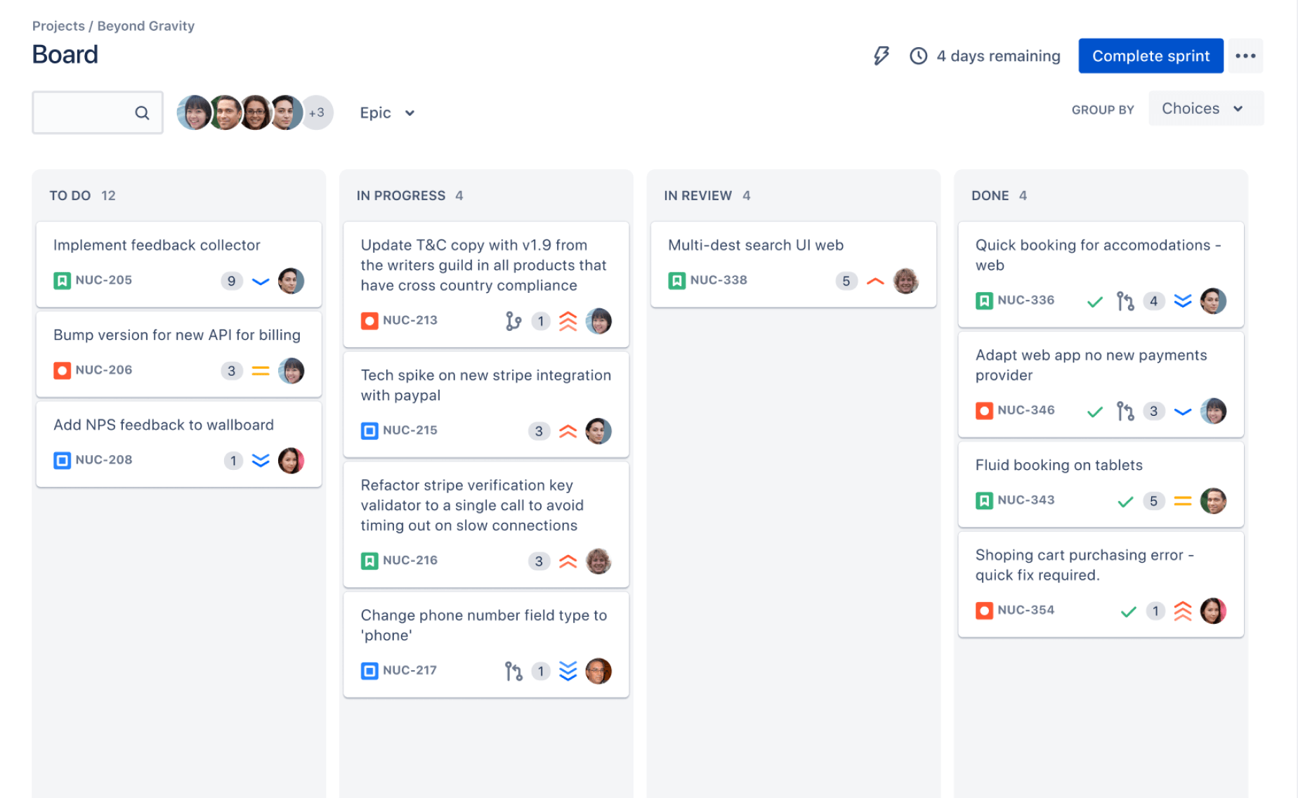
ONES.com combines project management and knowledge management in one platform powered by ONES Assistant. ONES Project is a Jira alternative for teams that need structured planning, timeline visibility, and flexible delivery workflows.
You can use ONES Project separately from ONES Wiki, which supports team knowledge management as a Confluence alternative. Both products are available as separate offerings.
Core Capabilities
Replace Manual Timeline Updates with Connected Project Planning
Pain: An Excel timeline needs manual edits whenever dates, owners, or task statuses change.
ONES capability: ONES Project connects tasks, schedules, assignments, and progress within a project workspace.
Result: Your team can review a current plan without rebuilding the visual after every change.
Handle Complex Work with Custom Workflows
Pain: A simple bar chart may not represent approvals, reviews, blocked work, or release gates.
ONES capability: Custom workflows and fields let you reflect the way your team actually moves work forward.
Result: A product team can track design review, security approval, testing, and release readiness as visible workflow stages.
Support Jira-Compatible Processes
Pain: Teams may want a different project platform without abandoning familiar issue and sprint practices.
ONES capability: ONES Project supports Jira-compatible workflows, sprint management, and structured task planning.
Result: Teams can keep recognizable delivery patterns while reducing dependence on a collection of separate tools.
Reduce Plugin Dependence
Pain: A timeline solution assembled from multiple add-ons can create maintenance work and inconsistent reporting.
ONES capability: Built-in reporting, automation, custom fields, and workflow controls are available within the project environment.
Result: You can manage more planning needs natively instead of stitching together numerous plugins.
Make Sprint Planning More Practical
Pain: A long-term timeline does not always show what the team should complete this week or sprint.
ONES capability: Sprint management connects near-term delivery planning with the broader project schedule.
Result: You can move from a release-level view to sprint-level work without maintaining separate planning systems.
Automate Repetitive Project Actions
Pain: Reassigning tasks, updating statuses, and notifying reviewers can consume time during every project cycle.
ONES capability: Automation can trigger routine actions when defined conditions occur.
Result: The team spends less effort on administrative updates and more effort resolving real delivery risks.
Choose a Deployment Model That Fits Your Environment
Pain: Some organizations cannot place project information in a public cloud environment.
ONES capability: ONES.com supports Cloud, On-Premise, Private Cloud, and Air-gapped deployments.
Result: You can select an operating model that matches security, compliance, and network requirements.
Keep Features Consistent Across Deployment Options
Pain: Self-hosted platforms sometimes provide fewer capabilities than hosted versions.
ONES capability: ONES.com provides full feature parity between its cloud and self-hosted versions.
Result: Deployment constraints do not automatically require your team to give up core project capabilities.
Start with a Small Team
Pain: Teams may hesitate to replace a simple planning method because adoption seems expensive or complicated.
ONES capability: The free plan supports up to 30 seats.
Result: A smaller team can test a structured project workflow before expanding its use across the organization.
Application Scenarios
Software release: A product team can connect epics, sprints, testing activities, approval stages, and release milestones. Project managers gain a broader timeline while developers continue working in structured sprint views.
Marketing campaign: A campaign team can plan creative work, review cycles, channel launches, and reporting deadlines. Automated status changes can reduce manual follow-up when approvals are completed.
Restricted-network project: A regulated engineering team can use an On-Premise, Private Cloud, or Air-gapped deployment. The team retains project planning and reporting capabilities while meeting its network requirements.
Common Challenges When Building a Timeline in Excel
The Bars Begin on the Wrong Dates
Problem: The start-date series may be missing, selected incorrectly, or formatted as text.
Solution: Confirm that Excel recognizes the dates as calendar values. Recreate the stacked bar chart with both Start Date and Duration included, then hide only the start-date series.
The Chart Shows Too Much Empty Space
Problem: The horizontal axis begins long before the first activity or ends far after the final deadline.
Solution: Format the axis and set practical minimum and maximum bounds. Leave a small margin so the first and last bars remain easy to see.
Tasks Appear Backward
Problem: The first task appears at the bottom, which feels unnatural during reviews.
Solution: Reverse the category order on the vertical axis. Check the result after changing it because Excel may also adjust where the horizontal axis appears.
Durations Become Inaccurate
Problem: Someone changes a date but forgets to update the duration.
Solution: Use formulas that calculate duration from the start and end dates. If the project uses working days, use a workday formula consistently throughout the schedule.
The Chart Becomes Difficult to Read
Problem: Too many tasks, colors, labels, and milestones compete for attention.
Solution: Group small activities into phases, limit the color palette, and show only milestones that affect decisions. Keep detailed operational planning in a separate view.
FAQs
Can I create a Gantt chart in Excel without a template?
Yes. You can create one manually with a stacked bar chart. Add task names, start dates, end dates, and calculated durations. Select the start-date and duration values, insert a stacked bar chart, hide the start-date series, and format the axes. A template can save time, but understanding the setup makes it easier to correct dates and customize the chart later.
What formula calculates task duration in Excel?
For calendar days, use a formula such as =EndDate-StartDate+1. If the start date is in B2 and the end date is in C2, use =C2-B2+1. For working days that exclude weekends, use =NETWORKDAYS(B2,C2). Choose the formula that matches how your team defines project duration.
How do I show progress on an Excel timeline?
Add a progress column with a percentage, such as 25% or 75%. You can create another chart series that represents completed duration, then use a darker color for completed work. For a simpler approach, use status labels and conditional formatting in the schedule. Keep the progress method consistent so stakeholders do not confuse planned duration with completed work.
Can an Excel Gantt chart show task dependencies?
It can show the timing of related tasks, but Excel does not automatically manage dependencies like a dedicated project platform. Add a predecessor column, milestone labels, or notes describing the relationship. For example, state that testing starts after build approval. When dependencies become numerous, a project management platform can make those relationships easier to maintain.
When should I move from Excel to project management software?
Consider moving when several people update the plan, dates change frequently, task dependencies are difficult to track, or stakeholders need live progress reporting. Excel remains practical for small and stable schedules. A dedicated platform becomes more valuable when maintaining the plan takes more effort than using it to make decisions.
Conclusion
You can create a timeline Gantt chart in Excel by preparing task dates, calculating durations, inserting a stacked bar chart, hiding the start-date series, and formatting the timeline. The eight-step process works well for small projects and straightforward schedules.
But here's the truth: the chart is only useful when the schedule stays accurate and readable. Review dates regularly, show meaningful milestones, and avoid filling one view with every minor activity.
When changing plans, multiple teams, dependencies, and reporting needs outgrow manual updates, a dedicated platform such as ONES Project can provide a more connected workflow. Start with Excel when it fits, then move to a structured project environment when coordination becomes the real challenge.