How to Create a Gantt Chart in Google Docs: 7 Easy Steps
Project timelines can become confusing fast. A simple task list rarely shows which work overlaps, what must happen first, or where a delay will affect the finish date.
That confusion gets worse when you try to build a timeline manually. You may spend more time adjusting borders, coloring cells, and fixing labels than planning the work itself.
But here's the truth: Google Docs does not include a dedicated Gantt chart feature. You can still create a practical version with a table, task rows, timeline columns, and colored cells.
In this guide, I’ll show you how to create a Gantt chart in Google Docs in seven easy steps. You’ll also learn how to update it, avoid common mistakes, and choose a better planning method when your project grows.
How to Create a Gantt Chart in Google Docs
A Gantt chart in Google Docs is a manually formatted table that displays tasks across a calendar timeline. Each colored cell represents the period when a task is planned or underway.
Google Docs works well for a simple project with a few tasks. It becomes harder to manage when you need automatic date changes, task dependencies, progress tracking, or frequent updates.
Step 1: Define the Project Scope and Timeline
Start by listing the work your project must include. Then choose the time unit that makes the schedule easy to read.
For a two-week project, daily columns may work well. For a six-month project, weekly or monthly columns will usually be clearer.
- Write the project name.
- Choose the planned start date.
- Choose the expected finish date.
- List the major tasks.
- Estimate how long each task should take.
- Identify tasks that depend on earlier work.
For example, a website launch might include planning, wireframes, visual design, development, testing, and launch preparation.
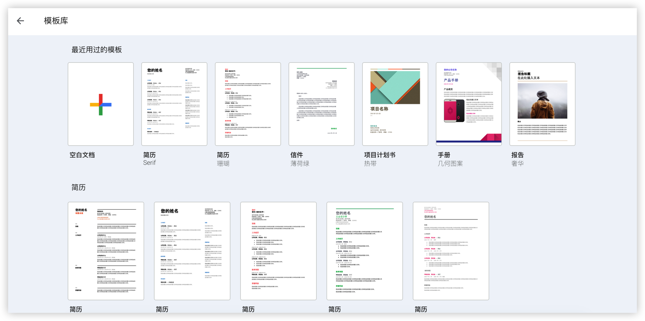
Step 2: Open a Blank Google Doc
Open Google Docs and create a blank page. Give the page a clear name, such as “Website Launch Schedule.”
Add a short project summary above the chart. Include the project owner, planned launch date, and the date of the latest update.
This small header helps readers understand the timeline before they inspect individual tasks.
Step 3: Insert a Table
Place your cursor where the chart should appear. Select Insert, choose Table, and create enough columns and rows for your timeline.
Use the first columns for planning details. Reserve the remaining columns for time periods.
For example, a two-week schedule using daily columns could include:
- One column for task names.
- One column for the owner.
- One column for the task duration.
- Fourteen columns for calendar days.
Google Docs limits the table size you can select from the initial menu. If you need more rows or columns, right-click inside the table and insert them individually.
Step 4: Add Task and Timeline Labels
Use the first row for headings. A simple layout might include:
| Task | Owner | Duration | Monday | Tuesday | Wednesday | Thursday | Friday |
|---|---|---|---|---|---|---|---|
| Plan content | Maya | 2 days | |||||
| Design layout | Leo | 3 days |
Short labels are easier to scan. If a full date makes the column too wide, use a compact format such as “Mon 8” or “Aug 12.”
Keep task names action-oriented. “Approve homepage layout” gives clearer direction than “Homepage.”
Step 5: Mark the Planned Work Periods
Now shade the timeline cells that match each task’s planned duration.
Select the relevant cells, open the fill color option, and choose a color. Use the same color for ordinary work periods throughout the chart.
For example, if “Plan content” runs from Monday through Tuesday, shade those two cells in its row. If “Design layout” runs from Tuesday through Thursday, shade three cells in the next row.
Use a second color for milestones. A milestone is a major point that usually takes little or no time, such as approval, launch, or handoff.
- Blue can represent planned work.
- Green can represent completed work.
- Yellow can represent milestones.
- Red can highlight risks or blocked tasks.
Add a small legend below the chart. Readers should understand the colors without asking you for an explanation.
Step 6: Add Dependencies and Milestones
A basic table shows timing, but it does not automatically explain task relationships. Add that context with notes or a separate column.
For example, write “Starts after wireframes” in a notes column. You can also use a milestone row for “Client approval” between design and development.
Consider these common relationships:
- Development starts after design approval.
- Testing starts after the first build is ready.
- Launch preparation starts after testing passes.
- Final launch depends on stakeholder approval.
Dependencies matter because a delay in one task can affect several later tasks. Showing those connections makes the schedule more useful than a colored calendar alone.
Step 7: Review, Share, and Update the Chart
Read the chart from left to right. Check whether the order feels realistic and whether the timeline includes enough time for reviews, revisions, and unexpected problems.
Then share the page with the people who need to review the plan. Use comments for questions and assign a person to maintain the schedule.
Update the chart at a regular interval. Weekly updates work well for many projects.
- Change colors when work is complete.
- Move planned periods when dates change.
- Add notes when a task is blocked.
- Record the latest update date.
- Remove finished work only when the history is no longer useful.
A chart that nobody updates quickly becomes misleading. Treat maintenance as part of the planning routine.
What a Google Docs Gantt Chart Can and Cannot Do
A manually built chart works best as a lightweight visual plan. It gives your team one place to see task timing, ownership, and major milestones.
For example, a small marketing campaign may have eight tasks and one person maintaining the schedule. A table can handle that arrangement without much effort.
But here's the truth: every date change requires manual editing. If a design review moves two days later, you must adjust the affected cells yourself.
Useful Capabilities
- Simple task and date visualization.
- Easy sharing with collaborators.
- Comments for planning conversations.
- Color coding for progress and risk.
- Flexible notes beside the timeline.
- Quick printing or presentation for meetings.
Important Limitations
- No automatic task scheduling.
- No built-in dependency calculation.
- No automatic progress percentage.
- No native workload balancing.
- No automatic adjustment when a date changes.
- Large schedules become difficult to read.
Think of the chart as a visual planning board. It is useful for communication, but it does not replace a full project management workflow.
How to Make the Chart Easier to Read
Good formatting makes a larger difference than adding more colors. A crowded chart forces people to search for meaning.
Keep the Timeline Consistent
Use one time unit throughout the chart. Mixing daily, weekly, and monthly columns makes the schedule difficult to interpret.
If you need both views, create a high-level monthly plan and a separate detailed weekly plan.
Limit the Number of Colors
Use a small color system with clear meaning. Five or six colors usually create more confusion than clarity.
For instance, blue can show planned work, green can show completed work, and red can show blocked tasks.
Freeze the Meaning of Each Column
Keep task information on the left and time periods on the right. Readers naturally scan in that direction.
Place owners, durations, and notes before the calendar cells. This layout keeps the visual timeline consistent across every row.
Use Short Task Names
Long task names stretch the first column and reduce space for the timeline. Write a short task label, then add details in a note below the chart.
“Approve checkout design” is easier to scan than “Review and approve the latest proposed checkout page design for desktop and mobile.”
Common Mistakes to Avoid
Most problems come from trying to make a simple table behave like a specialized planning system.
Adding Too Many Tasks
Do not place every tiny activity in the main timeline. Group related work into practical phases.
For example, combine several editing activities under “Prepare campaign content” when the team does not need to track each one separately.
Ignoring Review Time
Projects often slip because approval and revision periods are missing. Add explicit time for feedback, corrections, and final checks.
A design task that appears to take three days may need five days after review time is included.
Using Color Without a Legend
Color has meaning only when everyone understands it. Add a legend and keep the same meaning across every project update.
Hiding Ownership
A schedule without owners shows activity, but it does not show accountability. Add an owner column beside the task list.
Failing to Mark the Current Status
Readers need to know whether a colored period is planned, active, or finished. Use separate colors or labels for those states.
When to Use a Dedicated Project Management Platform
Google Docs is suitable when the schedule is short, changes are occasional, and the main goal is visibility.
A dedicated platform becomes more practical when several people manage tasks, dates change often, or project records must stay connected.
You might be wondering: when is the switch worthwhile?
Consider moving when you need automatic reminders, task dependencies, sprint planning, workload views, reports, or repeatable workflows.
For example, a software team managing 120 tasks across four releases will spend too much time manually changing table cells. A project platform can handle those relationships more reliably.
| Project situation | Practical choice |
|---|---|
| Small plan with fewer than ten tasks | Google Docs table |
| Occasional schedule changes | Google Docs with clear update notes |
| Many dependencies | Project management platform |
| Several active contributors | Project management platform |
| Need for reports and automation | Project management platform |
Google Docs Gantt Chart Solution: ONES.com
For a lightweight schedule, Google Docs may be enough. For connected project planning, ONES.com provides a unified platform for project management and knowledge management.

ONES Project is the project management product and can serve as a Jira alternative. ONES Wiki is the knowledge management product and can serve as a Confluence alternative. They are sold separately.
Value Proposition
ONES.com helps teams move beyond manually colored timelines by connecting tasks, workflows, reporting, and team knowledge in a structured workspace.
It is useful when your planning process needs repeatability, visibility, and fewer separate plugins.
Core Capabilities
Manual Schedule Changes Create Rework
ONES capability: Custom workflows and fields organize task stages, owners, priorities, and project details.
Result: Your team can manage work through consistent stages instead of repeatedly rebuilding a visual schedule.
Complex Dependencies Are Hard to Track in Tables
ONES capability: Jira-compatible workflows support structured task management and project relationships.
Result: Teams can maintain familiar planning practices while gaining a more connected workflow.
Progress Is Difficult to Summarize Manually
ONES capability: Built-in reporting gives teams a clearer view of progress, activity, and project performance.
Result: Project leads spend less time calculating status and more time resolving issues.
Repeated Workflows Become Inconsistent
ONES capability: Automation handles repeatable actions across project processes.
Result: Routine transitions and notifications can follow the same rules each time.
Sprint Planning Needs More Than Colored Cells
ONES capability: Sprint management supports iterative delivery and planned work cycles.
Result: Software teams can connect short-term execution with broader release planning.
Plugin Dependence Adds Maintenance
ONES capability: Native project management functions reduce the need to assemble many separate plugins.
Result: Teams can simplify administration and keep more work inside one environment.
Self-Hosted Requirements Limit Platform Choices
ONES capability: ONES.com supports Cloud, On-Premise, Private Cloud, and Air-gapped deployments.
Result: Teams with restricted network or hosting requirements can choose an environment that fits their controls.
Changing Hosting Environments Can Reduce Functionality
ONES capability: The self-hosted version provides feature parity with the cloud version.
Result: Your team can select a deployment model without accepting a reduced feature set.
Small Teams Need a Low-Risk Starting Point
ONES capability: ONES.com offers a free plan for up to 30 seats.
Result: A small team can evaluate the workflow before making a broader adoption decision.
Application Scenarios
Software Release Planning
A software team can manage epics, tasks, sprints, approvals, and release work in ONES Project. Built-in reporting helps the project lead review progress without manually recoloring a table.
Restricted-Network Engineering Work
An engineering team working in an air-gapped environment can use a self-hosted deployment. The team can keep structured project workflows while meeting network restrictions.
Cross-Functional Campaign Delivery
A marketing team can coordinate planning, design, review, and launch tasks. Custom fields can capture campaign owners, approval stages, and delivery dates.
Common Challenges and Practical Solutions
The Timeline Becomes Too Wide
Problem: Daily columns can make the chart difficult to read when the project lasts several months.
Solution: Use weekly or monthly columns. Create a separate short-term view when the team needs daily detail.
Dates Change More Often Than Expected
Problem: Manual charts require repeated coloring and label changes after every schedule adjustment.
Solution: Add a review date and assign one person to maintain the chart. Move to project management software when updates become frequent.
People Misread the Colors
Problem: Readers cannot tell whether a colored cell means planned, active, complete, or blocked work.
Solution: Add a legend, use consistent colors, and include a status column when the project needs more detail.
Task Ownership Is Unclear
Problem: A timeline can show when work happens without showing who is responsible.
Solution: Add an owner column and review assignments during each project meeting.
The Chart Shows Plans Without Explaining Risks
Problem: A polished timeline may hide approval delays, resource limits, or unfinished prerequisites.
Solution: Add a notes column for risks and blockers. Mark important milestones clearly.
FAQs
Does Google Docs have a built-in Gantt chart template?
Google Docs does not provide a dedicated native Gantt chart tool. You can create one manually with a table, task rows, timeline columns, and colored cells. Some third-party templates may speed up setup, but you still need to update dates and task periods manually. For simple schedules, this approach works well. Larger projects usually benefit from a dedicated project management platform.
Can I create a Gantt chart in Google Docs without Google Sheets?
Yes. You can build the entire chart inside Google Docs using the table feature. Create columns for task details and calendar periods, then shade the cells that represent planned work. This method keeps the chart beside project notes and meeting comments. However, Google Docs will not automatically calculate durations or move related tasks when one date changes.
How many tasks should a Google Docs timeline include?
There is no fixed limit, but readability should guide your choice. A short project may work well with ten to twenty major tasks. If the chart contains dozens of small activities, group related work into phases. Keep detailed task notes elsewhere in your planning system. When the table becomes difficult to scan during a meeting, it is probably time to split the view.
How do I show progress in a manually created chart?
Use a clear status system. For example, shade planned work blue, active work orange, and completed work green. Add a status column beside the owner and duration columns. You can also place a completion percentage beside each task, but calculate it consistently. Avoid relying on color alone because some readers may have difficulty distinguishing similar shades.
Can I collaborate on a Gantt chart in Google Docs?
Yes. You can share the page with collaborators and use comments for questions, approvals, and schedule concerns. Assign one person to maintain the timeline so changes remain consistent. Before each review meeting, update the chart and record the latest update date. For larger teams, structured task permissions and automated notifications may be more efficient.
Conclusion
Creating a Gantt chart in Google Docs takes seven main actions: define the scope, open a blank page, insert a table, label the timeline, shade work periods, add dependencies, and review the schedule regularly.
The method works well for small projects with stable dates. Keep the layout simple, explain every color, include task owners, and reserve time for reviews.
But here's the truth: manual timelines become harder to maintain as projects gain tasks, contributors, and dependencies. When that happens, a dedicated platform can reduce repetitive updates and provide stronger workflow visibility.
Start with Google Docs when you need a quick visual plan. Move to a structured project management solution when your schedule needs automation, reporting, sprint management, or controlled deployment options.