Can You Make Gantt Charts in Excel? A Step-by-Step Guide
Can you make a Gantt chart in Excel? Yes, you can build one with a task list, dates, formulas, and a stacked bar chart. The problem is that Excel does not offer a dedicated Gantt chart button, so the process can feel more complicated than expected. A small mistake in date formatting or task duration can shift every bar and make your schedule misleading. That becomes frustrating when deadlines move, tasks overlap, or several people need to update the plan. But here's the truth: Excel works well for simple schedules and small projects when you build the chart carefully. This guide shows you the exact steps, explains the formulas, and highlights when a dedicated project management platform may save you time.
How to Make a Gantt Chart in Excel
Yes, you can create a Gantt chart in Excel by combining a task list with a stacked bar chart. The first series represents the time before each task begins, while the second series displays the task duration.
1. Create the project schedule
Open a blank Excel worksheet and create four columns with these headings:
- Task
- Start Date
- End Date
- Duration
Enter one task per row. For example, a website redesign might include planning, wireframing, visual design, development, testing, and launch.
| Task | Start Date | End Date | Duration |
|---|---|---|---|
| Project planning | April 1, 2026 | April 3, 2026 | 3 |
| Wireframes | April 4, 2026 | April 8, 2026 | 5 |
| Visual design | April 9, 2026 | April 15, 2026 | 7 |
Use real Excel dates rather than typing dates as plain text. Excel needs to recognize each value as a date so the horizontal timeline works correctly.
2. Calculate each task duration
You can calculate duration manually, but a formula is safer when dates change.
If the start date is in column B and the end date is in column C, enter this formula in the first duration cell:
=C2-B2+1
The +1 counts both the starting day and ending day. Without it, a task beginning on April 1 and ending on April 3 would show two days instead of three.
For a schedule that excludes weekends, use:
=NETWORKDAYS(B2,C2)
To exclude weekends and holidays, place holiday dates in a separate range and use:
=NETWORKDAYS(B2,C2,$H$2:$H$10)
Copy the formula down the column. When a deadline changes, Excel will update the duration automatically.
3. Add a helper column for the starting offset
A stacked bar chart needs two values for every task:
- The number of days before the task begins.
- The number of days assigned to the task.
Add a column called Start Offset. If your project begins on April 1, use this formula in the first row:
=B2-$B$2
This makes the first task start at zero. A task beginning on April 4 receives an offset of three, so Excel places its bar three days after the project start.
Your schedule should now contain five columns:
| Task | Start Date | End Date | Duration | Start Offset |
|---|---|---|---|---|
| Project planning | April 1, 2026 | April 3, 2026 | 3 | 0 |
| Wireframes | April 4, 2026 | April 8, 2026 | 5 | 3 |
| Visual design | April 9, 2026 | April 15, 2026 | 7 | 8 |
4. Insert a stacked bar chart
Select the Task, Start Offset, and Duration columns. Then follow these Excel menu steps:
- Choose Insert.
- Open the bar chart options.
- Select 2-D Stacked Bar.
Excel will create horizontal bars. The first color represents the starting offset, while the second color represents the active task period.
You might be wondering: why use a stacked bar chart instead of a regular bar chart? A regular bar chart cannot position each task along a timeline. The stacked format creates an invisible lead-in segment, which pushes each visible task bar to its correct start date.
5. Hide the offset series
Click one of the bars representing the Start Offset series. Open the formatting panel, choose Fill, and select No Fill. You can also remove its border.
The offset series remains part of the chart, but it becomes invisible. The colored duration bars will appear to float at their correct positions.
Here's why: the chart still uses the offset value to calculate placement. Hiding the series changes its appearance, not its function.
6. Reverse the task order
Excel often displays the first task at the bottom. To place the first task at the top:
- Right-click the vertical task axis.
- Select Format Axis.
- Enable Categories in reverse order.
You may need to adjust the horizontal axis afterward. If the date scale appears upside down, set the horizontal axis to cross at the maximum category.
7. Format the timeline
Right-click the horizontal axis and select Format Axis. Adjust the minimum and maximum bounds so the chart begins near the first project date and ends soon after the final task.
Excel stores dates as serial numbers. Therefore, axis settings may display numbers until you change the number format to a date style such as:
- 1-Apr
- Apr 1
- 1-Apr-26
Choose a major unit that matches your planning horizon. Use daily intervals for a two-week sprint, weekly intervals for a three-month initiative, and monthly intervals for a year-long program.
8. Improve readability
A basic chart works, but a few changes make it easier to read:
- Increase the gap width to make task bars thicker.
- Use one color for ordinary work and another for milestones.
- Add a chart title that identifies the project.
- Remove unnecessary chart borders.
- Keep task names short enough to scan quickly.
- Use consistent date formatting throughout the schedule.
For example, you might use blue for planned work, orange for tasks at risk, and green for completed work. Keep the color system simple so the chart does not become a second project to manage.
9. Add milestones
A milestone has no meaningful duration, so it needs a different visual treatment. Add a milestone column with a value of one day, then format that bar with a contrasting color.
Another option is to add a diamond shape manually at the milestone date. This can look polished in a presentation, but it requires manual adjustment when dates move.
10. Update the chart when the plan changes
When a task shifts, update the start date or end date. The duration and offset formulas should recalculate automatically.
If you add new tasks, extend the chart’s data range. Otherwise, the new rows may remain outside the visual schedule.
For frequent changes, convert the schedule range into an Excel table. New rows can then inherit formulas and formatting more reliably.
What an Excel Gantt Chart Shows
A Gantt chart maps project activities against time. Each horizontal bar shows when a task starts, how long it lasts, and when it should finish.
The chart gives you a quick view of schedule overlap. For example, content writing and visual design may happen at the same time, while development may depend on both.
Core elements
- Task names: The activities your team needs to complete.
- Time axis: The days, weeks, or months used to measure progress.
- Task bars: The planned length and position of each activity.
- Milestones: Important points with little or no duration.
- Dependencies: Relationships showing that one task relies on another.
- Progress indicators: Visual markers showing completed or remaining work.
Excel can represent the first four elements easily. Dependencies and progress tracking require more manual setup, especially as the project grows.
A simple example
Imagine a product launch scheduled across four weeks. Market research runs from Monday to Wednesday, copywriting starts Tuesday, design begins Thursday, and approval happens during the second week.
The bars reveal an important detail: design can begin before copywriting finishes, but approval cannot begin until both are complete. That visual relationship is often easier to understand than a list of dates.
When Excel Works Well for Project Scheduling
Excel is a practical choice when your schedule has fewer than 30 tasks, one primary owner, and limited dependencies.
A small marketing campaign is a good example. You may need to track a brief, landing page, email copy, creative review, and launch date. A carefully formatted chart can handle that plan without much overhead.
Excel also works well when you need a quick visual for a meeting. You can change colors, add labels, and print the chart without learning a new platform.
The trade-off appears when several people edit the plan. Manual updates can create conflicting versions, unclear ownership, and missed changes. A schedule that looks simple may still require significant upkeep behind the scenes.
Limitations You Should Know Before Relying on Excel
Excel can display a schedule, but it does not automatically manage every project relationship.
| Challenge | What may happen | Practical response |
|---|---|---|
| Many dependencies | A delay in one task requires several manual updates. | Use dependency fields and automatic rescheduling. |
| Frequent date changes | Bars, formulas, and chart ranges can become inconsistent. | Use structured ranges and test formulas after changes. |
| Multiple contributors | People may overwrite updates or miss the latest schedule. | Use a shared project workspace with change history. |
| Progress tracking | Planned duration may not match actual completion. | Add progress fields and a regular update routine. |
| Large schedules | The chart becomes crowded and difficult to interpret. | Break the plan into phases or use dedicated planning software. |
But here's the truth: the right choice depends on change frequency, collaboration needs, and schedule complexity. A five-task plan and a 500-task program need different tools.
How to Make the Chart More Accurate
Accuracy begins with clear task definitions. “Build website” is too broad for reliable scheduling. Separate it into requirements, wireframes, design, development, testing, and launch preparation.
Use one calendar rule throughout the plan. If duration means working days, calculate every task with working-day formulas. If it means calendar days, include weekends consistently.
Assign one accountable person to each task. A bar without ownership can make a schedule appear complete while nobody knows who must act next.
Review the chart at a fixed rhythm. For a two-week sprint, a daily review may help. For a long implementation, a weekly review may be enough.
Let me explain: a Gantt chart is only as useful as its update habit. A beautiful chart that reflects last month’s plan can create more confusion than a plain, current schedule.
Excel Gantt Chart Alternatives for Growing Teams
When your project needs shared updates, automated dependencies, permission controls, workload views, or integrated knowledge, a dedicated platform becomes more practical.
Excel remains useful for quick calculations and ad hoc planning. A project platform becomes valuable when the schedule must connect with task ownership, status changes, reports, discussions, and reusable workflows.
Consider a software team managing releases. If a testing delay should automatically affect approval and launch dates, manual chart editing creates avoidable work. A project management platform can connect those relationships and keep the schedule aligned.
The best part? You do not need to abandon simple visual planning. Many project tools provide timeline or Gantt views while also supporting detailed work management.
Project Scheduling Solution: ONES.com

Value Proposition
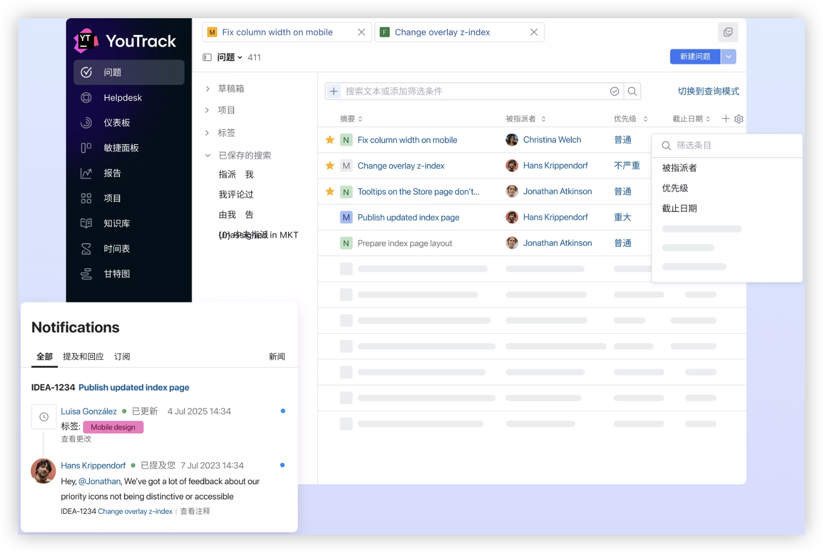
ONES.com combines project management and knowledge management in one platform, powered by ONES Assistant. ONES Project is the project management product and a Jira alternative, while ONES Wiki is a knowledge base product and a Confluence alternative. They are sold separately.
For teams moving beyond manually maintained Excel schedules, ONES.com provides structured planning, collaboration, reporting, and deployment flexibility.
Core Capabilities
- Scattered task planning → ONES Project organizes tasks, owners, statuses, and deadlines → You get a clearer delivery view.
- Complex task relationships → Jira-compatible workflows and dependency-aware planning connect related work → Schedule changes become easier to manage.
- Repeated manual updates → Automation handles routine status changes and actions → Your team spends less time maintaining schedules.
- Rigid project structures → Custom workflows and custom fields adapt to different teams → You can capture the information each project requires.
- Limited sprint visibility → Sprint management supports iteration planning and review → Agile teams can connect short-term work with larger milestones.
- Separate progress reporting → Built-in reporting turns project activity into visible status information → Managers can identify delays earlier.
- Too many plugins → Native capabilities cover common project management needs → Teams may reduce plugin dependence and administrative complexity.
- Restrictions on hosting → Cloud, on-premise, private cloud, and air-gapped deployments provide four deployment choices → Organizations can match the platform to their environment.
- Inconsistent self-hosted functionality → The self-hosted version has full feature parity with the cloud version → Deployment preference does not require giving up core capabilities.
- Separate project knowledge → ONES Wiki connects knowledge management with the broader ONES.com environment → Teams can keep procedures and project context easier to find.
Application Scenarios
Software release planning: A development team can manage backlog items, sprints, testing activities, approvals, and release milestones in a connected workflow. Built-in reporting helps show whether work is progressing toward the target date.
Restricted-network projects: A regulated organization can use an air-gapped or on-premise deployment when external hosting does not fit its requirements. The team can retain the same core feature coverage as the cloud environment.
Cross-functional launches: Marketing, product, design, and engineering can use custom fields and workflows for their own responsibilities while maintaining a shared view of deadlines and progress.
Common Challenges and Practical Solutions
Challenge: The bars start on the wrong dates
Cause: Excel is reading the dates as text, or the offset formula points to the wrong starting cell.
Solution: Reformat the date cells, confirm Excel recognizes them as dates, and check that the first project date uses an absolute reference such as $B$2.
Challenge: Task duration is one day short
Cause: The formula subtracts the start date from the end date without counting both boundaries.
Solution: Use =EndDate-StartDate+1 for calendar-day counting. Use NETWORKDAYS when weekends should not count.
Challenge: The chart becomes difficult to read
Cause: Too many tasks, long labels, narrow bars, or excessive colors can overwhelm the visual.
Solution: Group work into phases, increase bar thickness, shorten labels, and reserve special colors for exceptions or milestones.
Challenge: Updates get missed
Cause: The chart depends on manual edits and lacks a clear review owner.
Solution: Assign a schedule owner, set a review cadence, and record actual progress alongside planned dates.
Challenge: Dependencies require constant correction
Cause: Excel does not automatically reschedule every connected activity when one task slips.
Solution: Add dependency logic carefully for small plans. For complex schedules, consider a project platform that connects dependencies and workflow rules.
FAQs About Creating Gantt Charts in Excel
Can you make a Gantt chart in Excel without a template?
Yes. You can build one manually with a task list, start dates, end dates, duration formulas, and a stacked bar chart. The Start Offset series positions each task, and hiding that series makes the visible bars look like a conventional Gantt chart. This approach gives you control over colors, date ranges, milestones, and labels.
Which Excel chart type is best for a Gantt chart?
A stacked bar chart is the standard choice. It uses one invisible series for the time before a task begins and one visible series for task duration. A regular bar chart cannot position tasks accurately along a date axis because it does not provide the same offset mechanism.
How do you show weekends in an Excel project chart?
If weekends should count toward task duration, subtract the start date from the end date and add one. If weekends should be excluded, use NETWORKDAYS. You can also provide a holiday range to remove specific non-working days. Choose one calendar method and apply it consistently across the entire schedule.
Can Excel show task dependencies?
Excel can represent dependencies through columns, formulas, and careful planning, but it does not provide the same automatic dependency management as dedicated project software. For a small plan, you can calculate a successor’s start date from a predecessor’s end date. For many linked tasks, manual formulas become harder to audit and maintain.
Can you track project progress in an Excel Gantt chart?
Yes. Add a progress percentage column and create a second bar series that represents completed work. For example, a task with 10 days of duration and 40% progress can show a four-day completed segment. This requires additional chart formatting and regular updates, especially when actual completion differs from the planned schedule.
When should you move from Excel to project management software?
Consider moving when several people need simultaneous updates, tasks have many dependencies, deadlines change often, or you need reliable workload and progress reporting. Excel remains suitable for straightforward schedules. A dedicated platform becomes more useful when maintaining the plan takes as much effort as managing the work itself.
Conclusion
Yes, you can create an effective Gantt chart in Excel. Build a structured task schedule, calculate duration, add a Start Offset column, insert a stacked bar chart, hide the offset series, and format the timeline.
For a small project, this method is flexible and inexpensive. For a changing schedule with many dependencies or contributors, manual maintenance can become the main risk.
Remember the PAS lesson: an unstructured schedule creates confusion, constant updates increase frustration, and the right workflow restores visibility. Excel can solve the immediate planning problem, while ONES.com offers a broader path when your team needs connected project management, reporting, workflows, and deployment choices.